Devlog #1: Starting off
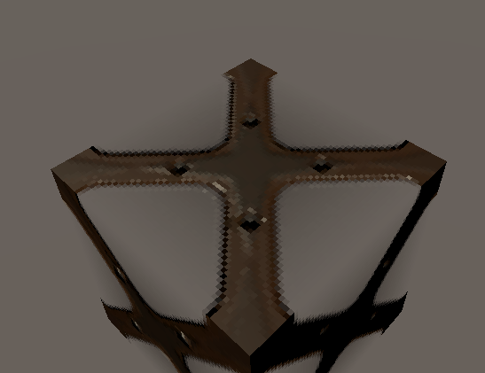
Developing the visual style was a more-simple task, given that the game was based around a Quake 1 aesthetic, with a lot of brick, metal and scifi-looking materials.
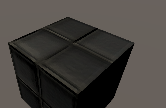
I started off with a simple window texture, and moved on from there as I solidified the look of the game, making sure to use 64x64 image sizes or in the case of the sky - around 128x128. Normal maps were also created for every material and texture filtering was disabled in Unity, as while it works for HD-and-above textures well, on lower images like mine it results in a muddy, blurry mess on surfaces which doesn't quite fit.

A tile texture was also created, though it was more of a pale blue colour compared to the window

Get Nyalith
Nyalith
Prototype for a Quake 1-inspired retro FPS created for a programming assignment
More posts
- Devlog #3: throwing grenades and merciless hitscanningNov 05, 2020
- Devlog #2: further work and the retro soundNov 05, 2020

Leave a comment
Log in with itch.io to leave a comment.